

You own a closet full of clothes but nothing seems to work together. The problem isn’t your wardrobe — it’s color. Most people guess when matching colors, and guessing leads to outfits that feel off. Color theory for outfits gives you a repeatable system. No art degree required.
These five rules cover how to pair colors, which neutrals actually work, and why some combinations look expensive while others look like a mistake. Start with rule one, because it fixes everything else.
Rule 1: The 60-30-10 Color Proportion
Every outfit needs a dominant color, a secondary color, and an accent. That’s the 60-30-10 split. Sixty percent of your outfit should be one color (pants, jacket, or dress). Thirty percent should be a second color (top, sweater, or skirt). Ten percent should be a bold accent (shoes, bag, scarf, or jewelry).
This ratio works because it creates visual hierarchy. The eye knows where to look first. Without it, outfits feel flat or chaotic.
How to Apply 60-30-10 to a Real Outfit
Take a pair of navy wool trousers ($80–$120, like Uniqlo or Banana Republic). That’s your 60%. Add a cream cashmere crewneck ($60–$150, Everlane or J.Crew). That’s your 30%. Finish with a rust-orange leather belt ($40–$70, Madewell or & Other Stories) and matching loafers. That’s your 10%.
The navy and cream are safe. The rust orange does the heavy lifting. Without that 10%, the outfit is boring. With it, the outfit looks intentional.
Most people skip the 10% entirely. They wear all neutrals and wonder why their clothes look like a uniform. Add one bright piece. A red bag. A cobalt scarf. Yellow sneakers. That single item changes everything.
Rule 2: Complementary Colors Are Not Your Friend (Mostly)
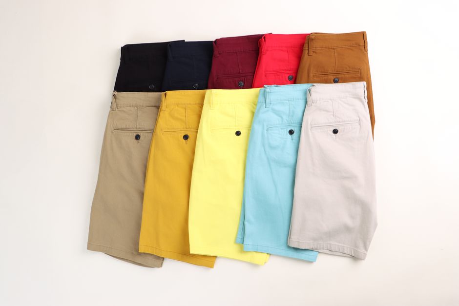
Complementary colors sit opposite each other on the color wheel. Red and green. Blue and orange. Yellow and purple. In theory, they look great together. In practice, they look like a holiday display or a sports team uniform.
The problem is intensity. Pure red next to pure green at full saturation is visually aggressive. It screams, doesn’t whisper. But complementary colors work when you break the saturation rule.
When Complementary Colors Actually Work
Use a muted version of one color and a saturated version of the other. A burgundy sweater (muted red) with olive chinos (muted green) looks sophisticated, not Christmas-y. A mustard top (muted yellow) with a deep plum skirt (muted purple) reads as editorial, not costume.
The safe move: pick one complementary pair and keep both colors low-saturation. Think dusty rose and sage. Or clay and slate blue. Those combinations feel rich without being loud.
Complementary colors fail most often when both are bright and equal in visual weight. If you wear a bright cobalt blue blazer, pair it with a pale peach top, not a bright orange one. Let one color dominate. Let the other soften.
Rule 3: Neutrals Are a Spectrum, Not a Category
Most people think neutrals are black, white, gray, and beige. That’s incomplete. Neutrals include navy, olive, burgundy, camel, charcoal, cream, taupe, and brown — but only when they’re used as the foundation of an outfit. A neutral is any color that fades into the background.
The mistake: wearing one neutral head-to-toe. An all-black outfit works. An all-beige outfit works. An all-gray outfit works. But mixing two neutrals without understanding their undertones creates a muddy mess.
The Undertone Rule for Neutrals
Warm neutrals (cream, camel, olive, rust-brown) pair with other warm neutrals. Cool neutrals (charcoal, navy, pure white, taupe) pair with other cool neutrals. Mix warm and cool neutrals and the outfit looks unintentional.
Example: a camel coat (warm) with cream trousers (warm) and brown boots (warm) = cohesive. A camel coat (warm) with pure white jeans (cool) and black boots (cool) = disjointed.
Test this in your closet right now. Pull three neutral pieces you think go together. Lay them out. If one looks off, check the undertone. That’s almost always the culprit.
Rule 4: Analogous Color Schemes Are the Easiest Way to Look Put-Together

Analogous colors sit next to each other on the color wheel. Blue, blue-green, green. Yellow, yellow-orange, orange. Red, red-violet, violet. These combinations are naturally harmonious because the colors share a common pigment.
This is the lowest-risk color strategy in fashion. You can’t mess it up. Pick three adjacent colors on the wheel, vary their saturation and lightness, and the outfit works.
How to Build an Analogous Outfit
Start with your dominant color. Say, forest green. Your secondary is teal (green-adjacent). Your accent is navy (blue-adjacent). Forest green trousers, a teal knit top, and a navy belt. That’s three colors, all from the same wedge of the wheel, and it looks intentional.
Another example: rust-orange pants, a peach blouse, and a warm brown jacket. The colors melt into each other. No sharp transitions. The eye travels smoothly.
Analogous schemes fail when you pick colors too close together. Light blue and medium blue and dark blue is boring, not harmonious. You need enough contrast between the three colors. Use different shades (light, medium, dark) or different saturations (muted, bright, dusty) to create depth.
Rule 5: Monochrome Is Not One Color — It’s One Color Family

Monochrome dressing gets a bad reputation because people think it means wearing the exact same shade head-to-toe. That’s not monochrome. That’s a uniform. Real monochrome uses multiple shades, tints, and tones of a single color family.
A true monochrome outfit might include a charcoal blazer, a medium gray tee, light gray trousers, and black shoes. That’s four different values of gray. It reads as sleek, not flat.
The Monochrome Formula That Works Every Time
Pick one color family. Choose five variations: one very dark, one dark, one medium, one light, one very light. Use the darkest as your anchor (pants or jacket). Use the medium as your main piece (top or dress). Use the lightest as your accent (shoes or bag).
Example in navy: navy blazer (dark), medium blue chambray shirt (medium), pale blue jeans (light), white sneakers (very light). Every piece is from the blue family, but the outfit has contrast because the values are different.
Monochrome fails when all pieces are the same value. A medium blue shirt with medium blue pants and medium blue shoes looks like a jumpsuit that forgot its top half. You need at least three distinct values to create shape.
| Color Rule | Best For | Common Mistake | Fix |
|---|---|---|---|
| 60-30-10 | Building outfits from scratch | Skipping the 10% accent | Add one bright accessory |
| Complementary | High-contrast looks | Using both colors at full saturation | Mute one color, saturate the other |
| Neutral Undertones | Mixing basics | Mixing warm and cool neutrals | Stick to one undertone per outfit |
| Analogous | Low-effort, high-harmony outfits | Colors too close in shade | Include light, medium, and dark |
| Monochrome | Sleek, elongated silhouettes | Same value head-to-toe | Use 3+ distinct shades |
These five rules cover 90% of color decisions in fashion. Start with the 60-30-10 ratio to structure any outfit. Use analogous or monochrome when you want certainty. Use complementary sparingly and always with muted versions. Check neutral undertones before combining them. That’s the system. No guesswork needed.
